We tried to make our package work as a whole by ensuring that there was a running theme throughout. The overall theme of ‘blue’ (background of advert and digi-pack, and a recurring colour within the video itself – mug, bed clothes, sweater) references the nickname ‘the blue album’ which fans coined the album shortly after its release, as well as tying the three new products together.
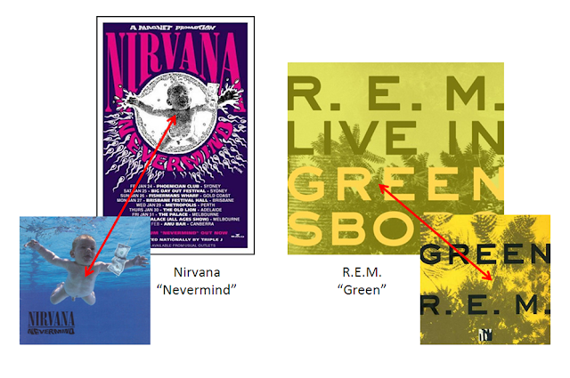
There are many clear links between the digi-pack and the magazine advert. The way the album artwork is featured on the advert means that if a consumer were to see the advert they would be able to easily identify the album within a shop and because of the rating included on the advert (***** - Q) will be more encouraged to buy it (the Two-Step Flow Model). By doing this, we have stuck to the conventions of existing products as many other bands do this, for example Nirvana - using the swinning baby from the covewr of Nevermind on their tour poster, and R.E.M who also depicted the cover of their album Green on an advertisment. These album covers and posters are featured below. In addition to this, we have used the traditional ‘Weezer font’ of Century Gothic on both the digi-pack and advert – meaning that it is obvious to the audience and fans that the album is a Weezer product.
We decided to make the artwork of the album fairly song specific to The Sweater Song – including a photograph of an unravelling sweater and ‘sweater texture’ as the background of a number of the panels (all blue to maintain the brand image) - as we had seen a number of albums that also use this technique (Jens Lekmans’ Night Falls over Kortedala – featuring the artist having a haircut which reflects the lyrics in the song Shirin and The Pixies’ Doolittle – featuring a monkey with a halo and the numbers 5, 6 and 7 reflecting the lyrics of Monkey gone to Heaven ‘If man is five and the devil is 6 then God is 7’). We decided to follow these guidelines, not only because its conventional (and Weezer are a very conventional band) but also because it implies to the audience that this particular song is an important one to the band, which could be the selling point to someone who is considering buying it.
In addition, the way we have included the ‘special features’ sticker on the front of the digi-pack mirrors the little information given on the advert, which further persuades consumers to purchase the album.


No comments:
Post a Comment